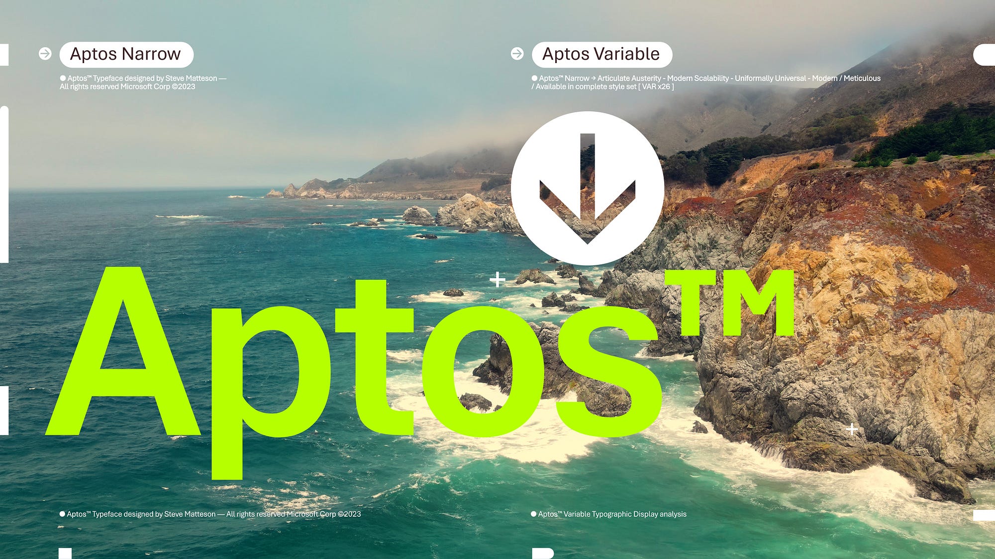
I learned more than a year ago that Microsoft would be changing the default font in Microsoft 365, and Microsoft announced the change in July 2023 (here), but the change made its way to me only yesterday: the new default font is … Aptos.
Here’s what I say in the fifth edition of A Manual of Style for Contract Drafting:
This author switched from Times New Roman to Calibri. That’s why the indented extracts of contract text throughout this manual are in Calibri, as are the samples and the redrafted version of the contract in the appendix. But in 2021, Microsoft announced that it plans to replace Calibri as the default font. Unless you’re subject to institutional requirements, be open to alternatives.
For now, I’m inclined to use Aptos for contracts. I care about being clear, concise, and relevant; which font I use has nothing to do with that. All I need from a font is that it be simple and readable. I’m not looking to impress anyone, and I’m not looking to establish a brand—at least not yet. And I’m not so fond of Calibri that I’m going to stick with it.
What do you think?

I had been unaware of this switch, but I just tested it out. Aptos seems to occupy a good deal more lateral space than Calibri, without being noticeably easier to read. I’ll stick with Calibri for now.
I like Aptos. I liked Calibri, but at 68 I’ve learned that flexibility is a good thing and it doesn’t hurt to be open to change. I did adjust the size from 11 to 10 because Aptos takes up a little more room, but if that’s all I have to worry about, it’s a good day. I’m just glad my computer wasn’t mucking with me.
Aptos is very harsh on the eyes and it doesn’t look good at all in ay spreadsheets / charts / pivot tables, etc. Calibri was so much easier and now all of the users in our company are freaking out over this new change. No amount of individual default changing back to Calibri works under each program… Microsoft just decides that this is best for us.
Thank you for that perspective!
1/ I can’t imagine why Microsoft keeps changing its standard fonts. Is it simply “freshening” its brand, or are there problems solved or advantages secured by Aptos? Will they be changing it out like hem lengths in five years?
2/ I have always preferred serif fonts, imagining that the extra “clues” given by serifs made the letters more easily apprehended by the eye, but studies to which I defer show that what’s most legible is what the individual is most used to. So my leaning toward Cambria is just a unscientific preference, I guess.
Great font. I have used it and it is better than Calibri
Late response driven by my late discovery of Aptos (perhaps driven by OS-adoption).
Overall, a surprisingly high quality default or ‘system’ font originating from a firm that has more/less disregarded any form of font-related improvement or innovation for what feels like decades.
Certainly an attractive option and viable competitor relative to dozens of Google’s similarly ‘free’ fonts. Refreshing, but still safely conservative (thinking workplace appropriateness) comes to mind.
Of note, this may be MSFT’s first default font choice that is also a ‘real’ font family (i.e., beyond the Default ‘Body’ typeface, Light, Narrow, Display, Black, and ExtraBold are offered, plus Mono and Serif).
Making all formats available for different use cases (e.g., in addition to TTF / EOT, access to web fonts such as WOFF, WOFF2, SVG, etc.) would potentially increase the appeal of Aptos that much more.