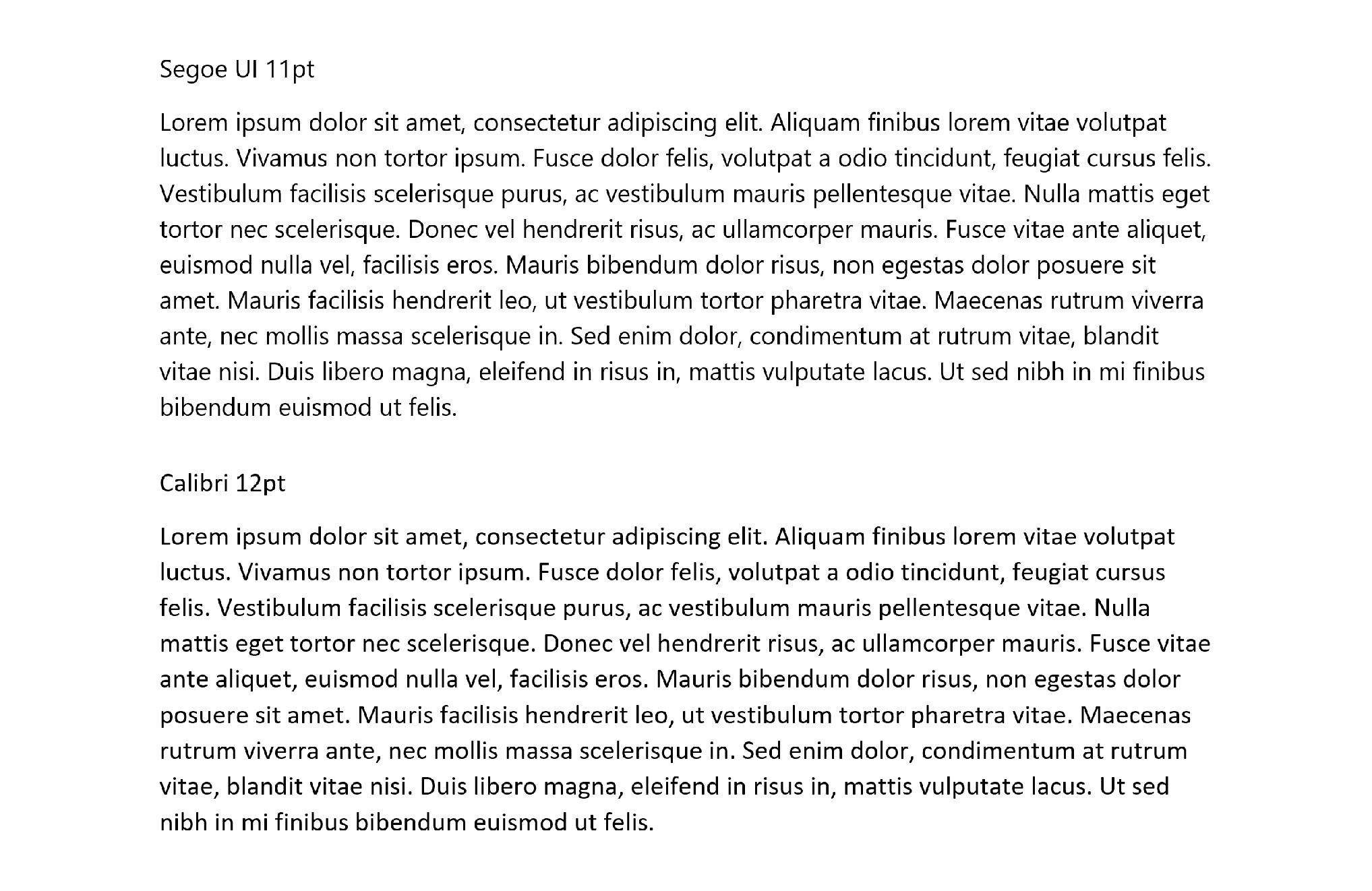
Last week a client told me that it uses the typeface Segoe UI (pronounced SEE-go) for its contracts. I wasn’t familiar with it, so I checked it out. Go here for the Wikipedia page for it. And the image below shows it alongside Calibri. Segoe UI is a system font, so it’s safe to use—it won’t default to some other font on someone else’s computer. Matthew Butterick rates it, and Calibri, “OK in limited doses.” I declare Segoe UI unobjectionable.

When I can get away with it, I go .pdf and lose the system fonts. Two columns, Neutra Text Alt body, and Proxima Nova headings—what do people think?
Hope it’s okay I take this as opportunity to share some drafts. Still a MSCD newb, < 4 months, still developing in the style. No doubt a ways to go, but here's where I am with it now. Am I doing it right? For document design and MSCD usages both, grateful for any input I can get :) https://uploads.disquscdn.com/images/ee0c74df63d85c663e303e140fb5e09f903086e5bf1e45383b3377c40fb334a1.jpg https://uploads.disquscdn.com/images/ad13f9aa29bbbba715f600f52f2aa1b99364b85e72f81a3d787b7c05ec2b5a8f.jpg https://uploads.disquscdn.com/images/49a202904a7af18db1771dbb0032d8487bee328ce1c24b6c74c2c1c02c49e1ed.jpg https://uploads.disquscdn.com/images/5564a14fba28734444174ed62eef3dbd10090fc26844e844cc284e207ffc2e80.jpg https://uploads.disquscdn.com/images/dc49d0245e1efc12d0f4a805803da100bee7f5dadaa3f06ae08ef7a039d32e31.jpg https://uploads.disquscdn.com/images/8a3805866ea8b9b7c610413d15c9910eb5c8f72d6eedda78ce5aec6e792565d0.jpg https://uploads.disquscdn.com/images/a669bbb689b1e4b3e799b7e09ab00916e7cd4c036bd3948f3a7f1e8f708352c7.jpg https://uploads.disquscdn.com/images/45f9a89e4ad44435b7076bee33d757e3306c89453beab713977cc68ce5e79801.jpg
When I can get away with it, I go .pdf and lose the system fonts. Two columns, Neutra Text Alt body, and Proxima Nova headings—what do people think?
Hope it’s okay I take this as opportunity to share some drafts. Still a MSCD newb, < 4 months, still early on developing in the style. No doubt far to go, but here's where I am with it ATM. Am I doing it right? For document design and MSCD usages both, grateful for any input I can get :) https://uploads.disquscdn.com/images/09c71eea4ecdcace4ce7f2628f9ff5c5061b3b46a4f2c57024a21b18a1f0053e.jpg https://uploads.disquscdn.com/images/dc49d0245e1efc12d0f4a805803da100bee7f5dadaa3f06ae08ef7a039d32e31.jpg https://uploads.disquscdn.com/images/8a3805866ea8b9b7c610413d15c9910eb5c8f72d6eedda78ce5aec6e792565d0.jpg https://uploads.disquscdn.com/images/a669bbb689b1e4b3e799b7e09ab00916e7cd4c036bd3948f3a7f1e8f708352c7.jpg https://uploads.disquscdn.com/images/45f9a89e4ad44435b7076bee33d757e3306c89453beab713977cc68ce5e79801.jpg https://uploads.disquscdn.com/images/f74075879203d2512a58d9cbece2023627a4f30d5dfa17d78443bb067dde79bf.jpg https://uploads.disquscdn.com/images/ad13f9aa29bbbba715f600f52f2aa1b99364b85e72f81a3d787b7c05ec2b5a8f.jpg https://uploads.disquscdn.com/images/b272313c01d65b966c241cf7878e0c432361654d4d2dad08dd43dba1b2739b7b.jpg
When I can get away with it, I go .pdf and lose the system fonts. Two columns, Neutra Text Alt body, and Proxima Nova headings—what do people think?
Hope it’s okay I take this as opportunity to share some drafts. Still a MSCD newb, < 4 months, still early developing in the style. No doubt a far to go, but here's where I am ATM. Am I doing it right? For document design and MSCD usages both, grateful for any input I can get :) https://uploads.disquscdn.com/images/c5271c1162e7e1c57fc7b4d031ebd4d5ba1449c8b5687cf3a057196567fa5b88.jpg https://uploads.disquscdn.com/images/30afe954ef07d11aa90ab5b173ee53ee51f5bc3875ca0cc2557e7c4cbd6c9704.jpg https://uploads.disquscdn.com/images/8a3805866ea8b9b7c610413d15c9910eb5c8f72d6eedda78ce5aec6e792565d0.jpg https://uploads.disquscdn.com/images/a669bbb689b1e4b3e799b7e09ab00916e7cd4c036bd3948f3a7f1e8f708352c7.jpg https://uploads.disquscdn.com/images/45f9a89e4ad44435b7076bee33d757e3306c89453beab713977cc68ce5e79801.jpg https://uploads.disquscdn.com/images/f74075879203d2512a58d9cbece2023627a4f30d5dfa17d78443bb067dde79bf.jpg https://uploads.disquscdn.com/images/ad13f9aa29bbbba715f600f52f2aa1b99364b85e72f81a3d787b7c05ec2b5a8f.jpg https://uploads.disquscdn.com/images/b272313c01d65b966c241cf7878e0c432361654d4d2dad08dd43dba1b2739b7b.jpg
FWIW Segoe doesn’t appear to be a system face in the Mac OS. I find Calibri dully satisfactory, but think Optima and Verdana have more flair (and, for that matter, flare).
I like Book Antiqua; Butterick has no problem with it. Not a big fan of 2-column contracts; readability is adversely impacted and it’s harder to mark them up if you’re on the receiving end.
I know this is an old post but I use Segoe UI 10.5 for my consumer-facing agreements and I’m now switching to it for template IT service agreement. I think it’s a nice balance between the traditional fonts and Calibri. But of course, it’s only a personal preference.
I might offer my consulting clients Segoe UI as a less generic alternative to Calibri.